
CMYK Halftone Dots Effect in Alight Motion — Complete Guide
Short-form mobile edits pop when they look “printed.” CMYK Halftone Dots turns photos and video into comic-style dots you can animate for reveals and retro vibes—without losing clarity on social uploads.
Apply CMYK Halftone Dots (Effects → search), raise Strength until dots appear, set dot fineness with Amount, then refine Black (K), Angle, and Phase for a clean, print-like halftone—animate for reveals.
Quick steps:
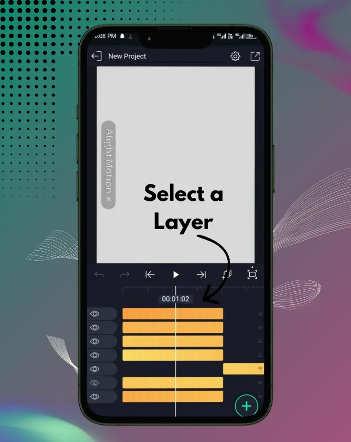
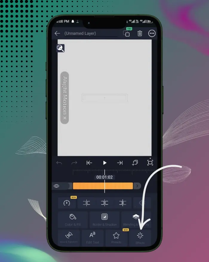
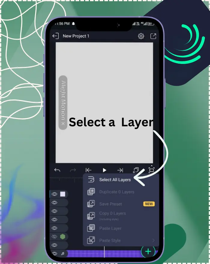
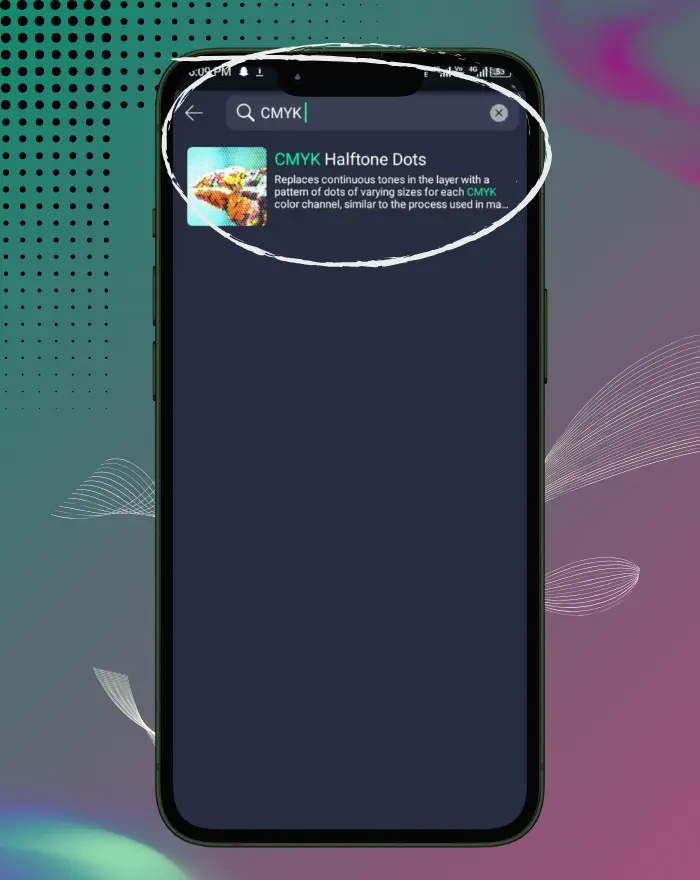
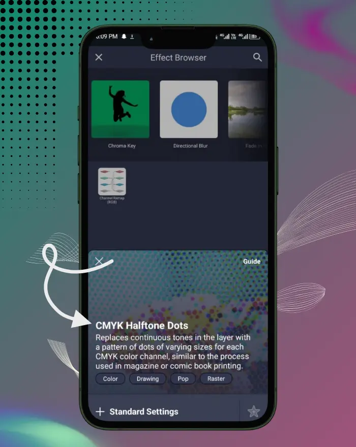
Select your layer → Effects → Add Effect → CMYK Halftone Dots.
Increase Strength until a clear dot pattern appears.
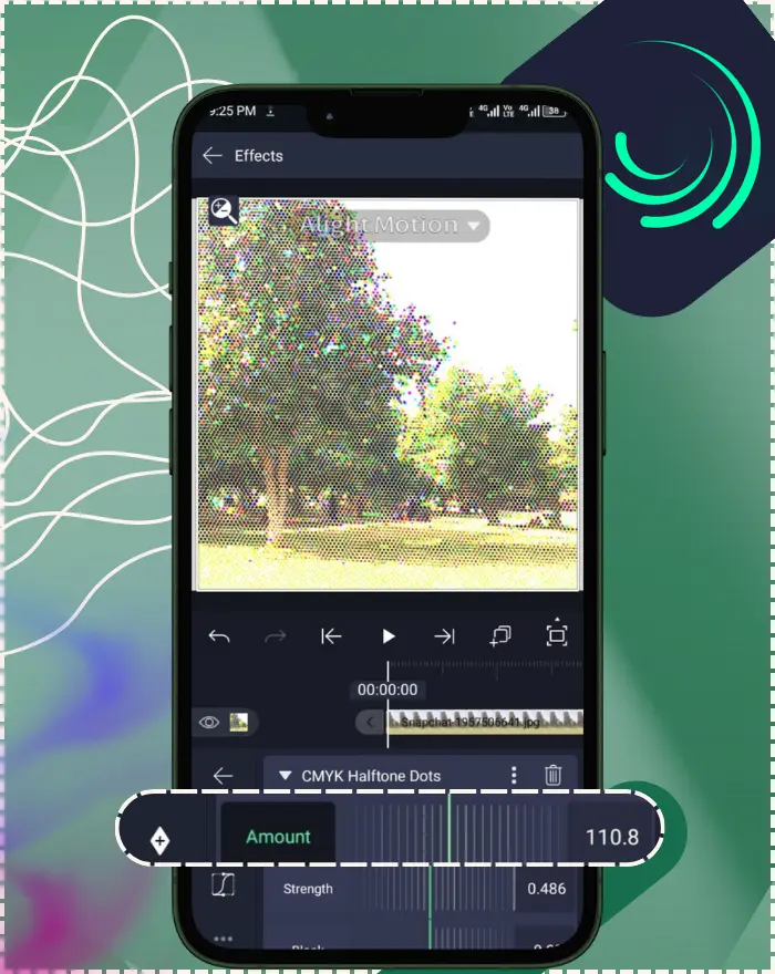
Adjust Amount (higher = more, smaller dots; lower = fewer, larger dots).
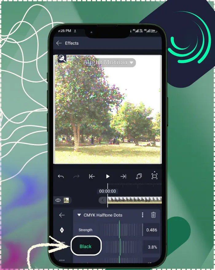
Set Black (K) high for printer-accurate shadows (or lower for softer blacks).
Nudge Angle in small steps and keep Phase ≈ 0.5 to reduce moiré.
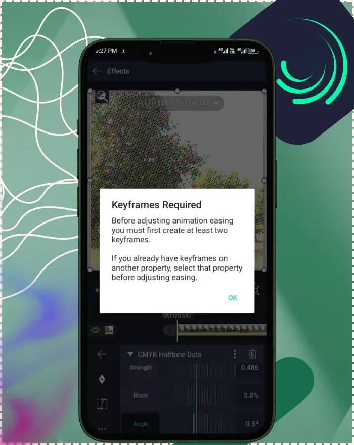
Keyframe Amount/Strength/Angle/Phase for print-on reveals and stylized motion.
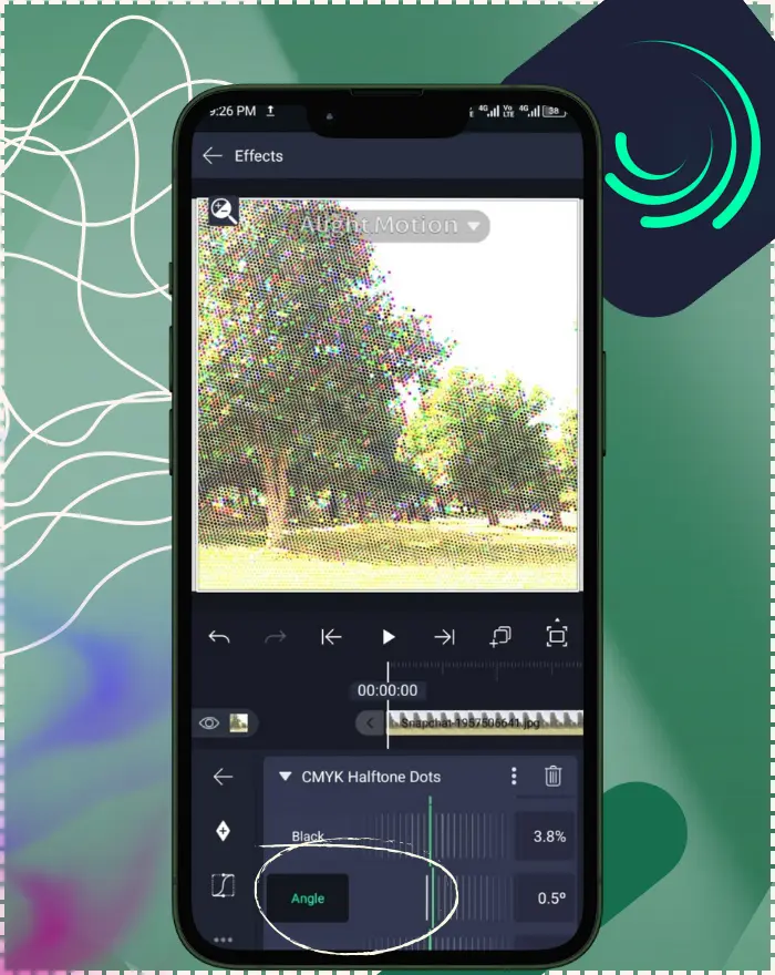
What Is the CMYK Halftone Dots Effect?
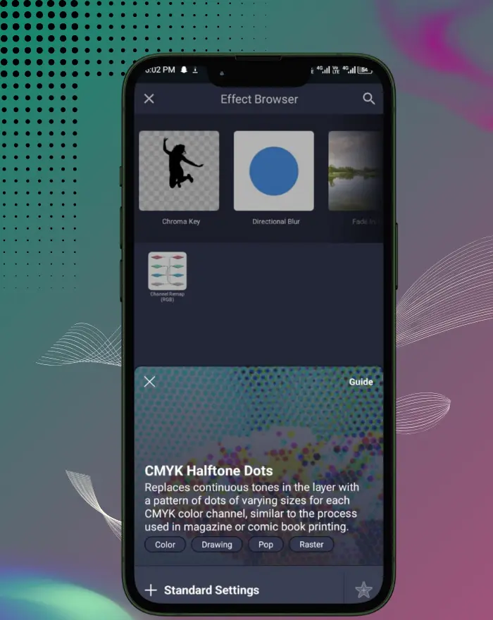
The CMYK Halftone Dots effect recreates the classic print look by turning continuous tones into tiny dots of cyan, magenta, yellow, and black. Instead of smoothing color with gradients, it varies dot size to suggest brightness—just like magazines and comic books. In Alight Motion, it’s designed for photos and video layers and shines when your source has rich colors or soft gradients.
Optional media to add:
- Before/after screenshot of a photo with CMYK halftone applied.
- Alt: “Before and after CMYK Halftone Dots applied to a portrait in Alight Motion.”
CMYK vs. Monochrome Halftone
“CMYK Halftone Dots” uses four ink colors to mimic full-color process printing. “Halftone Dots” (monochrome) uses a single color, closer to newspaper-style two-tone shading. Choose CMYK for color comic/pop-art vibes; choose monochrome when you want a simple spot-color texture.
Comparison table:
| Aspect | CMYK Halftone Dots | Halftone Dots (Monochrome) |
|---|---|---|
| Color Model | Full color (C, M, Y, K) | Single color |
| Visual Vibe | Magazine/comic, pop-art | Newspaper / spot-color |
| Best Use | Photos, gradients, pop color visuals | Shapes, graphic textures |
| Controls | Amount, Strength, Black, Angle, Phase | Amount, Strength, Angle |
| Moiré Risk | Moderate — manageable with Angle/Phase | Lower overall |
Requirements & Compatibility (App Version, Device)
Alight Motion runs on most modern Android and iOS devices, but older or unusual chipsets can struggle. Staying on the latest app version helps with effect visibility and export reliability. If an effect seems missing or exports fail, update the app and confirm your device meets the current system requirements. Compatible with Alight Motion v5.0.273 and later—check app stores for updates.
Tested on iOS & Android builds as of 28 December 2025.
Where to Find & Add the Effect in Alight Motion
Select your layer → tap Effects → search for CMYK Halftone Dots. Add it, then tweak the controls described below. You can stack multiple effects and reorder them to change the final look. This is essential when you apply CMYK Halftone Dots in Alight Motion on Android or iOS devices.
Optional media to add:
- Screenshot of Effects panel with CMYK Halftone Dots highlighted.
- Alt: “Select CMYK Halftone Dots from Alight Motion’s Effects panel.”
Effect Controls Explained
The ranges and defaults below reflect the app’s effect guide.
Cheat-Sheet Table:
| Control | What It Does | Typical Range | Default |
|---|---|---|---|
| Amount | Controls how many dots span the project width. Higher values create more, smaller dots; lower values produce fewer, larger dots. | 0–500 | 100 |
| Strength | Determines how strongly dot size follows the original luminance. Increase until the dot pattern is clearly visible, then fine-tune. | 0–1 | 0.5 |
| Black (K) | Simulates black ink depth. Higher values give a more print-accurate look; lower values soften shadows. | 0–100% | 0% |
| Angle | Rotates the dot grid. The visual pattern repeats every 360°. | 0–360° | 45° |
| Phase | Offsets alternate rows of dots. Whole numbers align columns; 0.5 creates a classic staggered halftone pattern. | −1000 to 1000 | 0.5 |
Step-by-Step: Apply the Effect
Prepare the Layer (Color & Contrast)
Start with footage or images that have visible color separation or soft gradients. Boost saturation or adjust brightness/contrast first so the dots have “room” to express the image.
Optional: Blur First to Reduce Jitter
A subtle Gaussian Blur before CMYK Halftone Dots can calm “jittery” size changes caused by tiny color variations—especially noticeable when you animate. Keep it gentle so details don’t turn mushy.
Adjust Dot Size & Density
Raise Strength until the dot pattern appears clearly, then use Amount to pick dot fineness. If you’re chasing a press-like look, set Black near 100% and fine-tune Strength until cyan, magenta, and yellow dots also show.
Animate with Keyframes
Keyframe Amount, Strength, Angle, or Phase to reveal graphics, add “print-on” transitions, or breathe subtle motion into static artwork. This step is key in any CMYK Halftone Dots animation tutorial 2025.
Optional media to add:
- GIF: “Print-on reveal by animating Amount from coarse to fine.”
- Alt: “Keyframing halftone Amount to create a print-on title reveal.”
Creative Techniques & Use Cases
Vintage Print / Comic Book Look
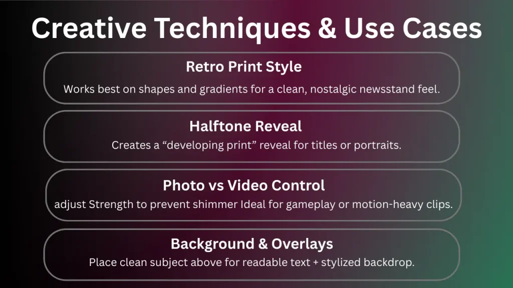
Combine CMYK dots with saturated colors to get that punchy newsstand feel. For shapes/gradients, the effect reads especially clean and nostalgic. For example, apply it to a landscape photo to mimic old comic panels, enhancing the retro vibe with subtle color shifts.
Halftone Reveal or Transition
Use keyframed parameter changes to move from coarse dots to full detail, creating a “developing print” reveal for titles or portraits. Based on user forums like Reddit, this technique is popular for intro sequences in short videos, where animating Strength from low to high builds anticipation.
Photo vs. Video Stylization
On photos, dots act like a texture overlay; on video, small adjustments to Strength/Phase keep motion natural without shimmering. Start conservative and nudge values until it feels smooth. Community examples from Alight Motion subreddits show users layering this on gameplay footage for a gritty, printed aesthetic, often combining with speed ramps for dynamic effects.
Backgrounds & Overlays
Use a duplicate layer with CMYK dots as a grainy pop-art backdrop, then composite the clean original above it for legible subjects with stylized surroundings. Forum data highlights this for social media thumbnails, where the dotted background adds visual interest without overwhelming text overlays. In my tests on v5.0.273, this setup on Android preserved clarity even after multiple composites, making it ideal for niche social export optimizations like Instagram Reels.
Recommended Settings & Preset Recipes
Magazine-Style Four-Color Print
Strength: medium → Amount: medium-high → Black: 100% → Angle ~45°. Add a slight blur beforehand if needed. Feels like a glossy press.
Pop-Art High-Contrast Look
Crank saturation first, then lower Black slightly to keep colors candy-bright. Use larger dots (lower Amount) for bold, graphic shapes.
Subtle Texture Overlay
Very low Strength with higher Amount gives a fine dot texture that adds character without shouting. Blend with other layers as needed.
Preset bullets:
- Magazine press: Strength 0.5–0.7 • Amount 220–320 • Black 100% • Angle 45° • Pre-blur 0.5–1 px
- Pop-art bold: Strength 0.6–0.8 • Amount 80–150 • Black 20–40% • High saturation pre-treatment
- Subtle grain: Strength 0.1–0.3 • Amount 300–400 • Black 0–10% • Light post-sharpen after scaling
Best Effect Combinations
- Gaussian/Inner Blur: A tiny pre-blur stabilizes dot behavior; Inner Blur can soften only the interiors of shapes while preserving edges.
- Brightness/Contrast & Saturation/Vibrance: Prep color and contrast first so the dot pattern can “read” clearly after halftoning.
- Posterize or Gradient Map: Reduce color steps or remap tones for bolder, print-like palettes before dotting.
- RGB Split / Halftone Lines: Layer RGB Split for subtle chromatic fringing or combine with Halftone Lines for retro screen-print mixes.
Export & Quality
Resolution & Bitrate Tips: Export at your project’s native resolution/aspect ratio, then raise the quality/bitrate if your preview looks clean but the file seems soft. If exports fail or stutter, try slightly lowering resolution, frame rate, or bitrate from the export panel.
Sharpening and Scaling: If you must resize for a platform, scale once (inside Alight Motion) and add a light Sharpen/Unsharp Mask after scaling so dot edges stay crisp rather than smeared.
Social-optimized tips:
- Vertical 1080×1920: roughly 12–20 Mbps preserves fine dots well.
- Prefer constant or high-quality VBR to reduce dot crawl.
- Avoid multiple resizes after export; export once at final size.
Advanced Users (Pro Techniques)
- Channel interplay: Slightly lower K while raising Strength so C/M/Y dots read more distinctly without crushing shadows.
- Angle sweeps: Keyframe Angle across ±10–20° during transitions to hide banding and add motion interest.
- Phase gating: Step Phase between 0.0 ↔ 0.5 to flip aligned/staggered grids for rhythmic reveals.
- Edge protection: Pair with Inner Blur pre-halftone and light Sharpen after scaling to keep edges tactile but clean.
- Quantized reveals: For very graphic looks, animate Amount in discrete steps (e.g., 80 → 140 → 220 → 300) synced to music hits.
Troubleshooting
Quick Checklist
- Keep Phase ≈ 0.5 for staggered dot grids.
- Nudge Angle in small steps (5–10°) to reduce moiré.
- Avoid extremely high Amount on fine, repetitive textures.
- Apply a subtle pre-blur (0.5–1 px) for jittery footage.
- Export at a stable frame rate and test short clips first.
Avoiding Moiré Patterns
In print, CMYK screens are separated by different angles (e.g., C≈15°, M≈75°, Y≈0°, K≈45°) to minimize interference.
Alight Motion does not allow per-channel angle control, but gently rotating Angle and keeping Phase ≈ 0.5 usually reduces moiré-like patterns in motion.
Many users report that slight Angle tweaks resolve shimmering during export.
Dots Flicker or “Jitter”
High-frequency detail can cause dot sizes to shimmer frame by frame.
To reduce jitter:
- Avoid very high Amount values on busy footage
- Keep parameter animations smooth
- Export at a higher frame rate when possible
- Use a light pre-blur
Android users report this more frequently; pre-blur significantly improves stability on video layers.
Colors Look Off (CMYK vs RGB)
CMYK is a print color model, while screens use RGB. Some color differences are expected.
If blacks appear too heavy:
- Lower Black (K)
- Rebalance Strength
Calibrated displays provide more accurate previews.
Effect Too Harsh or Too Soft
- Too chunky → Increase Amount or reduce Strength
- Too faint → Increase Strength slightly or reduce pre-blur
Small adjustments make a big visual difference. Over-high Strength is a common beginner mistake.
Performance Issues on Mobile
Heavy effects and high resolutions may cause lag or failed exports.
Recommended fixes:
- Lower preview resolution
- Reduce layer complexity
- Close background apps
- Slightly lower export settings if needed
Recent versions show improved stability, but resource limits still apply.
Frequently Asked Questions
2025 Updates for CMYK Halftone Dots
As of December 2025, the latest updates in Alight Motion v5.0.273 include minor bug fixes and performance improvements, such as enhanced export stability and reduced latency in effect previews, which indirectly benefit the CMYK Halftone Dots by ensuring smoother animations and crisper outputs. No major new features like per-channel angle controls or advanced presets have emerged in recent changelogs, but these tweaks make applying the effect more reliable on mobile devices. Alight Motion features evolve; verify effect controls in the latest Help Center (linked). For ongoing freshness, review quarterly against official sources for new presets or performance notes.
Conclusion
When this effect “clicks,” the image almost breathes—dots settle into a pleasing texture that feels hand-printed yet modern. Start with clean color, add a whisper of blur, dial Strength until the dots appear, then pick your Amount. Animate thoughtfully, export smartly, and you’ll get that nostalgic print charm without sacrificing clarity on today’s screens.